The viewport meta tag tells a browser how to size and scale a webpage on different devices, and it is one of the most important foundations of modern responsive design. Without it, mobile users often see tiny, zoomed‑out versions of desktop pages, forcing them to pinch and zoom just to read basic text.
Contents
The viewport meta tag fixes this by giving the browser clear instructions on how to display your layout across screen sizes. It is widely described as a key ingredient of responsive web design because it controls viewport dimensions and scaling, ensuring content is easy to view on any device.
What the viewport meta tag does
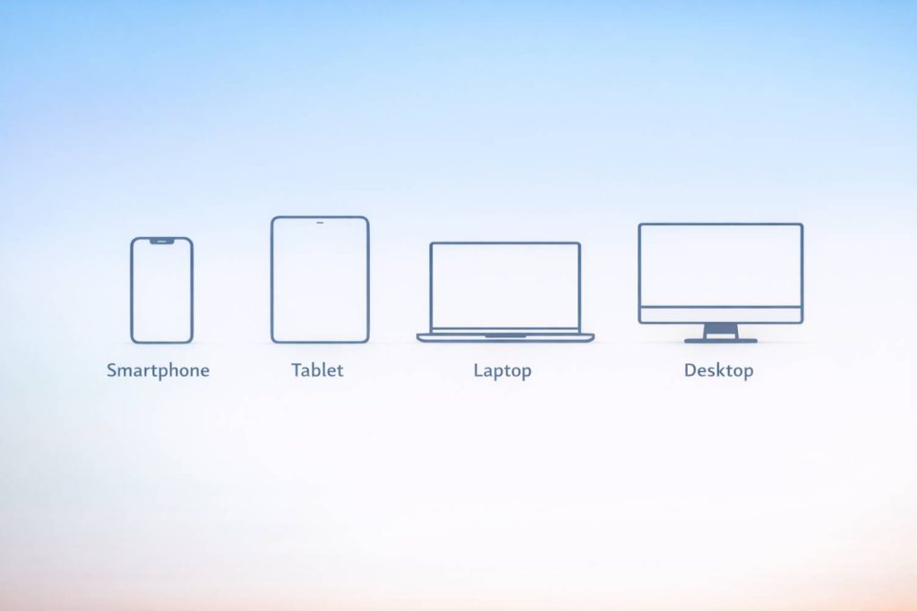
The viewport is the visible area of a webpage, and it changes depending on the device. A phone has a much smaller viewport than a desktop monitor, and even resizing a browser window changes the viewport.
Because viewports rarely match the full width of a webpage, browsers need guidance on how to render content. The viewport meta tag provides that guidance by defining how wide the page should be and how it should scale.
A standard, recommended version looks like this:
<meta name="viewport" content="width=device-width, initial-scale=1.0">
This tells the browser two things:
- width=device-width — match the page width to the device’s screen width.
- initial-scale=1.0 — load the page at a 1:1 scale without zooming.
Why the viewport meta tag matters for mobile users
When a site doesn’t include the viewport meta tag, mobile browsers assume the page is designed for a much larger screen. The result is a tiny, unreadable layout that requires constant zooming. This is one of the most common causes of poor mobile experiences.
A mobile‑friendly guide explains that the viewport meta tag prevents this by telling the browser exactly how to display the page on smaller screens, eliminating the need for pinch‑and‑zoom.
This makes the tag essential for:
- Readability on phones and tablets
- Proper scaling of text and images
- Avoiding horizontal scrolling
- Ensuring layouts adapt fluidly to different screen sizes
Get a free blog health check!
Ensure your blog is in great shape, to rank high and attract readers, with BlogVitals.
Try BlogVitals free →No credit card required. Get insights in minutes.
How the viewport meta tag supports responsive design
Responsive design relies on flexible layouts, fluid grids, and media queries—but none of these work correctly without the viewport meta tag. It is the foundation that allows CSS to respond to the actual device width.
A responsive design guide notes that configuring the viewport tag is a key step in building layouts that adapt smoothly across devices.
With the viewport meta tag in place, your CSS breakpoints behave as intended, and your design can scale naturally from desktop to mobile.
Why the viewport meta tag matters for SEO
Search engines prioritise mobile‑friendly websites, and the viewport meta tag is a core requirement for mobile optimisation. A guide on responsive design highlights that with billions of smartphone users worldwide, websites must adapt flawlessly to every screen dimension—and the viewport meta tag is the “unsung hero” that makes this possible.
SEO benefits include:
- Better mobile usability scores
- Improved rankings on mobile search
- Reduced bounce rates from frustrated mobile users
- Stronger overall user experience signals
Best practices for using the viewport meta tag
To get the most value from the viewport meta tag, keep these guidelines in mind:
- Use the standard syntax unless you have a specific reason to modify it.
- Avoid disabling user zoom unless absolutely necessary.
- Pair the tag with responsive CSS and flexible layouts.
- Test your site on multiple devices and screen sizes.
- Ensure images and media scale correctly within the responsive layout.
These practices help ensure your site remains readable, accessible, and user‑friendly across all devices.
Conclusion
The viewport meta tag is small but essential. It ensures your blog or website displays correctly on every screen, supports responsive design, and strengthens your mobile SEO.